A Guide to Neutral Wall Art for Calm Interiors
Neutral wall art uses soft, understated tones to bring calm and cohesion to your home. From warm beige and cream to cool stone grey and muted greens, these pieces create atmosphere without overwhelming a space. Whether you prefer abstract compositions, misty landscapes, botanical prints, or coastal scenes, neutral artwork offers a timeless foundation for considered interiors. This guide will help you choose the right colour palette, subject, format, and size for your room—so your walls feel finished, balanced, and quietly beautiful.
What Is Neutral Wall Art?
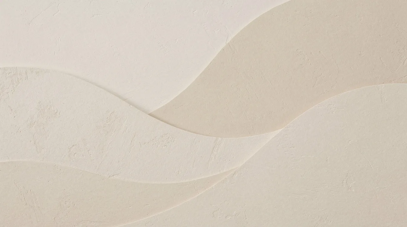
Neutral wall art is artwork dominated by soft, understated colour palettes rather than saturated hues. The key colour families include beige, cream, taupe, stone grey, warm browns, black and white, muted greens, and very soft coastal blues. These tones are celebrated for their ability to create a calm, cohesive, and airy atmosphere in home decor.
What makes neutral art so versatile is its range of subjects and formats. Abstract art uses shapes, colours, and forms to create compositions that do not necessarily represent the visual world, allowing for personal interpretation and emotional response. Minimalist art focuses on simplicity and limited colour palettes, emphasising the beauty of form and space—making it a popular choice for neutral-themed decor. Neutral art styles often include soft botanical line drawings and textured paintings, which create a sophisticated and tranquil atmosphere.
You will find neutral wall art available as fine art prints on archival paper, framed prints ready to hang, and canvas wall art with beautiful texture and presence. This versatility means neutral artwork pairs effortlessly with any decor style, adding elegance without overwhelming the space.
The timeless quality of neutral wall art comes from its ability to work across interior styles—from Scandinavian minimalism and warm modern interiors to coastal spaces and traditional homes. When the undertones, subject, and format align with your room, neutral pieces feel anything but plain.
Why Neutral Wall Art Works So Well in Calm Interiors
Neutral wall art creates atmosphere without competing for attention. Research in environmental psychology shows that colours from the neutral and white spectrum have a restorative effect on stress, helping reduce neural activation following acute stress compared to more saturated hues. This makes neutral artwork ideal for spaces designed for rest and comfort.
Using a calming colour palette in wall art helps create a restful sanctuary, free from visual clutter. A soothing palette of beige, taupe, soft grey, and cream enhances tranquillity, making these tones perfect for bedrooms, living rooms, and any space where you want to feel at ease.
Neutral art works harmoniously with natural textures like wood, linen, stone, and ceramic. It allows furniture, lighting, and material finishes to shine rather than fighting for visual attention. This makes rooms feel more considered and finished without being loud.
The flexibility of neutral artwork means you can change cushions, throws, and accent pieces around it without worrying about clashing colours. It softens empty walls while maintaining serenity, providing a gentle anchor that supports the mood of your home rather than dictating it.
Choose a Neutral Colour Palette That Suits Your Room
Selecting the right neutral tones depends on your room’s existing undertones and the atmosphere you want to create.
Beige and cream wall art feels warm, relaxed, and easy to style with most interiors. These tones work beautifully in living rooms with natural wood floors, brass fixtures, or cream sofas. Ivory and soft sand tones add gentle depth without overwhelming.
Taupe and stone tones are elegant, sophisticated, and grounding for contemporary spaces. They pair well with mid-century modern furniture and minimalist styling, bringing quiet elegance without coldness.
Warm earth tones feel natural and comforting, adding gentle character. Desert landscapes, forest and woodland-inspired prints, ochre abstracts, and soft terracotta shades work particularly well in spaces that embrace organic materials and textures.
Soft greys are calm and minimal, ideal for cooler colour schemes. Light grey wall art works beautifully in bedrooms and home offices where you want serenity without warmth.
Black and white artwork provides timeless contrast, structure, and definition. When a room needs visual anchoring or a more graphic quality, black and white pieces can add quiet drama while remaining neutral.
Muted greens and coastal blues are still neutral when soft and desaturated. These nature-inspired tones bring organic calm, connecting interiors with the natural world—particularly effective in coastal-style homes or biophilic designs.
Choose the Right Subject and Format for Your Space
The subject of your neutral wall art affects mood as much as colour. Abstract neutral wall art offers subtle movement and works well in modern interiors where you want visual interest without literal imagery. Shapes, gradients, and organic forms invite personal interpretation and emotional response.
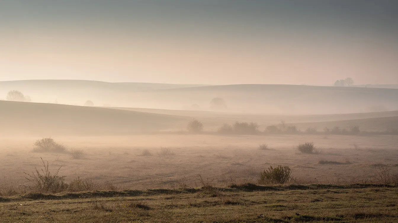
Neutral landscape wall art brings atmosphere, depth, and a sense of place. Misty horizons, quiet woodland scenes, and soft aerial views create calm focal points that feel connected to nature. Coastal and botanical prints add organic detail—waves, grasses, leaves, and textures that bring the outdoors in.
Black and white photography offers quiet contrast and sophistication. When a room needs definition without colour distraction, monochrome pieces provide structure and timelessness, while canvas wall art can add extra texture and depth.
Format matters too. Fine art prints on archival paper offer exceptional detail, delicate texture, and subtleties of gradient and tonality. They are more versatile for framing and easier to protect with UV glass. Framed neutral wall art gives a polished, ready-to-hang feel that works beautifully in living rooms, bedrooms, hallways, and home offices. Neutral canvas wall art adds texture and presence, making it useful for larger walls or relaxed contemporary spaces where you want depth without glass glare.
Consider fine art prints when you want flexibility and refined detail. Choose framed prints when you prefer ready-to-style convenience, and explore framed canvas options when you want added depth. Opt for canvas when texture and scale are priorities.
How to Style Neutral Wall Art in Different Rooms
Living Room Styling
In a living room, neutral wall art can serve as a calm focal point above a sofa, fireplace, sideboard, or console table. Large-scale pieces—typically 90 to 150 centimetres wide—work well as statement anchors and represent a significant portion of art sales for good reason: they fill wall space confidently without overwhelming.
For gallery walls, keep the colour palette consistent across pieces. Mixing warm and cool neutrals carelessly can create visual tension, so choose artwork with compatible undertones. Spacing between frames should feel deliberate—roughly 5 to 8 centimetres works well for a cohesive gallery wall arrangement.
Pair neutral art with tactile interiors: linen cushions, wool throws, wooden furniture, and ceramic accents. This layering adds richness and prevents the space from feeling flat.
Bedroom Styling
In a bedroom, neutral artwork should support rest rather than compete for attention. Position calming pieces above the bed, where soft landscapes, minimal abstracts, or gentle botanical prints can set a serene tone.
Symmetrical pairs of framed prints on either side of the headboard create balance and calm. Choose subjects with low visual tension—mist, horizon lines, soft shapes, gentle movement—rather than busy compositions or high contrast that might feel stimulating.
Soft tones like ivory, cream, and light grey are particularly restful here, helping create a sanctuary free from visual clutter.
Hallways and Small Spaces
Hallways, landings, and smaller corners benefit from artwork that adds interest without crowding. Framed neutral prints, black and white pieces, or smaller landscape artwork can create a considered feel in narrow or compact areas.
For transitional spaces, repeated pieces or diptychs can guide flow and add rhythm. Keep frames slim—natural wood or thin black edges work well—and scale artwork to around 60 to 70 percent of the wall width for proportion.

Common Mistakes to Avoid When Choosing Neutral Wall Art
Even the most beautiful neutral artwork can miss the mark if you overlook a few common pitfalls.
Choosing pieces too small for the wall is perhaps the most frequent mistake. Artwork that is undersized looks lost and fails to anchor the space. As a general guide, aim for artwork width around three-quarters to the full width of the furniture beneath it, and refer to guidance on choosing the right art size for your room.
Using only similar beige tones without any contrast or depth can make a room feel flat and forgettable. Mix warm and cool neutrals carefully, or add contrast through black, charcoal, or deeper earth tones in frames or matting.
Selecting artwork that completely disappears into the room happens when tones match the wall paint too closely. A slight contrast—even in texture or frame colour—helps the piece hold presence.
Ignoring frame colour and quality can undermine even excellent prints. Cheap frames degrade, and mismatched undertones clash. Natural wood tones, minimal black, or clean white frames typically complement neutral artwork beautifully.
Focusing only on colour rather than mood and atmosphere is another trap. A piece might match your palette perfectly but feel wrong in subject or energy. Always consider whether the artwork supports the feeling you want in the space.
Quick checklist when shopping:
-
Does the scale suit the wall?
-
Is there enough tonal contrast for the piece to hold presence?
-
Does the subject support the mood of the room?
-
Does the frame colour work with your interior?
-
Does the overall feel support calm and balance?
FAQ
What colours count as neutral for wall art? Neutrals include white, cream, beige, taupe, stone grey, warm browns, black, and very desaturated greens or blues when used sparingly. The key is soft, understated tones that do not dominate a room. Neutral tones such as beige, taupe, soft grey, and cream are celebrated for their ability to create a calm, cohesive, and airy atmosphere in interior design.
Can neutral wall art still create a focal point? Absolutely. Large scale, tonal contrast, texture, and strong compositions—horizon lines, dramatic light, soft movement—allow neutral artwork to anchor a room effectively. Size matters: large artworks between 90 and 150 centimetres represent around 31 percent of all art sales and work beautifully as statement focal points.
Should I choose framed prints or canvas for neutral artwork? It depends on your priorities. Fine art prints offer finer detail and are easier to frame under glass for protection, while framed and unframed options each suit different styling needs. Canvas provides texture, works without glass, and suits larger walls or relaxed contemporary spaces. Framed prints give a polished, ready-to-hang feel that works beautifully across living rooms, bedrooms, and hallways.
How do I prevent neutral art from looking bland? Use tonal contrast, texture, and subject matter with movement—clouds, soft abstract lines, horizon mist. Frame colour can add definition. Layering multiple neutral pieces with compatible undertones adds richness. The key is to include enough variation in tone or texture so the artwork holds presence rather than fading into the wall.
What size neutral wall art works best above a sofa? Aim for artwork width around three-quarters to the full width of your sofa. For a sofa 180 centimetres wide, a piece between 135 and 180 centimetres works well. Position the bottom edge roughly 20 to 25 centimetres above the furniture for comfortable visual balance.
Final Thoughts: Neutral Wall Art for a Calm, Considered Home
Neutral wall art is a simple way to bring calm, warmth, and quiet character into your home. The right piece can soften a room, create a gentle focal point, and help your interior feel more complete without overpowering the space.
Whether you prefer soft abstract artwork, misty landscapes, coastal prints, black and white pieces, or nature-inspired fine art, the key is to choose artwork that feels connected to the mood of your room. When the colours, subject, size, and frame all work together, neutral wall art can feel anything but plain.
Need Help Choosing?
Still deciding which neutral wall art is right for your space? Get in touch and we’ll be happy to help you choose the right artwork, size, frame, and finish for your room.
